

I’ve got a beauty for you all today, Wayfarers! I’m so excited to get to help promote –
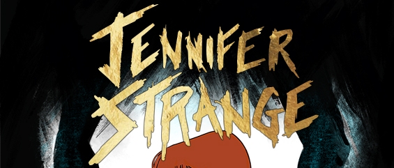
JENNIFER STRANGE, by Cat Scully,
releasing July 23, 2019 from Haverhill House Publishing.
Not only did she get to design her own cover, but also create the illustrated map for her book, as well. How cool, right? Has that ever happened before? So unique! This cover was officially unveiled on YABC, so go find that post for the giveaway and details – which IS international, yay!!!

When I first discovered this was coming out, I knew I needed to get as involved as I could! JENNIFER STRANGE is to be an illustrated YA horror/comic AND I COULD NOT BE MORE EXCITED!
So, scroll down a bit to see the beauty…
…
…
…

And the map –

About the Book
When her father disappears, Jennifer Strange moves in with her estranged sister Liz in Savannah, Georgia, one of the most haunted places in the United States. When the ghosts begin to tear Jennifer and Liz’s lives apart, the sisters must learn to trust each other again if they hope to uncover the truth about their family history. If they can’t sort out their differences, they’ll not only destroy the veil between the living and the dead, but fall into the hands of a rival family that wants them dead.
Cat Scully’s illustrations bring the ghosts and demons of her fictional world to eerie and beautiful life, harkening back to the style of SCARY STORIES TO TELL IN THE DARK and Ransom Riggs’ MISS PEREGRINE’S HOME FOR PECULIAR CHILDREN.
I was also lucky enough to have gotten to ask Cat Scully some questions about designing her cover, so read on, Wayfarers!
QUESTIONS:
1. What was your favorite part of illustrating your cover?
Concepting it! I loved seeing how many different covers I could come up with to represent the same thing. One of my favorite images wasn’t used as the final cover (because it wasn’t EXACTLY what I wanted) but I will probably do a giveaway of it in the future. That’s my favorite part about art is the process and finding the right image and typography to convey the right message. I am such a designer! All of my writing I think visually first. Honestly, I was so nervous to do the cover. I thought our staff cover artist, Dyer Wilk, was going to do it. His work is so brilliant. I’m in awe of his talent. I sheepishly sent him a sketch of what I was thinking. He told me I was good. I didn’t need him. And I totally didn’t believe it. I didn’t feel good enough to do my own cover! I gathered my courage and did it though. I’m so happy with the result, and it makes me want to do more covers!
2. Hardest part?
Having to be my own client as well as my own designer. There were moments I had a lot of “Oh I’d love to do this kind of map!” or “That cover style looks awesome, but which style? They’re all good! I can’t decide!” I had to be the designer and go “that isn’t possible in the time frame” or “that style doesn’t work for what you’re going for.” But it really wasn’t as bad as all that. Actually, I have sort of the opposite problem as a designer. I’m notoriously good at taking criticism and at being a gun-for-hire when it comes to design. Maybe too good. But Jennifer Strange was the first art project I’ve ever done where I had such a strong artistic vision and I had to speak up with my own voice. I was very nervous to illustrate my own project, believe it or not. When I had to stand up and say something for myself artistically, I realized I do have a voice, and I want Jennifer Strange to look like THIS.

3. What was it like to have the responsibility and freedom to design your own cover?
It’s a lot of responsibility to do a cover. Not that it isn’t to do the interiors. A lot of weight is placed on maps. But covers are a whole other beast. You have to think about first impressions. Everything has to be right in tone, including character pose, facial expression, style, elements, and typography. It’s really very much like a tightrope walk. One wrong element and the whole thing is off. I went through a lot of revisions getting the right idea to be the best it could be. I sent it to two trusted cover designers whose work I admire, Dyer Wilk and Todd Keisling, and asked for their feedback. I also sent it to comic book writer Christopher Golden. Their criticism and suggestions shaped the final cover into what it is now. It’s worth its weight in gold to get yourself some publishing friends who will be honest with you, but also have the skill and knowledge to thoughtfully back that criticism up. Dyer suggested the blue haze in the cover while using a pose from a recent drawing I posted to Instagram. Todd suggested I take the girl I designed and place her inside my first cover sketch, which was of two hands encircling the logo. Chris suggested I make her face more comic and less anime. It took a village, but it was so worth it get their suggestions while also pushing back with my own thoughts. My editor John was very funny and supportive through the whole process. I tend to hold myself to a certain standard. He reminds me my art and writing are in fact okay. Not just okay, but great.
4. Anything we should know about it or anything you’d like to share?
Where to find her:
Instagram: https:/www.instagram.com/CatMScully
Author Bio:
You can follow Cat on Twitter or Instagram at @CatMScully or visit her website at www.catherinescully.com

Neat interview! She had some great words about being your own client and designer…that has to be hard because you’re also your own critic and advocate!
LikeLiked by 1 person
Wasn’t it great? She’s awesome
LikeLiked by 1 person
Seems like a different book. I loved her interview. I haven’t read a graphic book since ages..
LikeLiked by 1 person
She was totally cool!
LikeLiked by 1 person